Information Architecture research on notifications categories
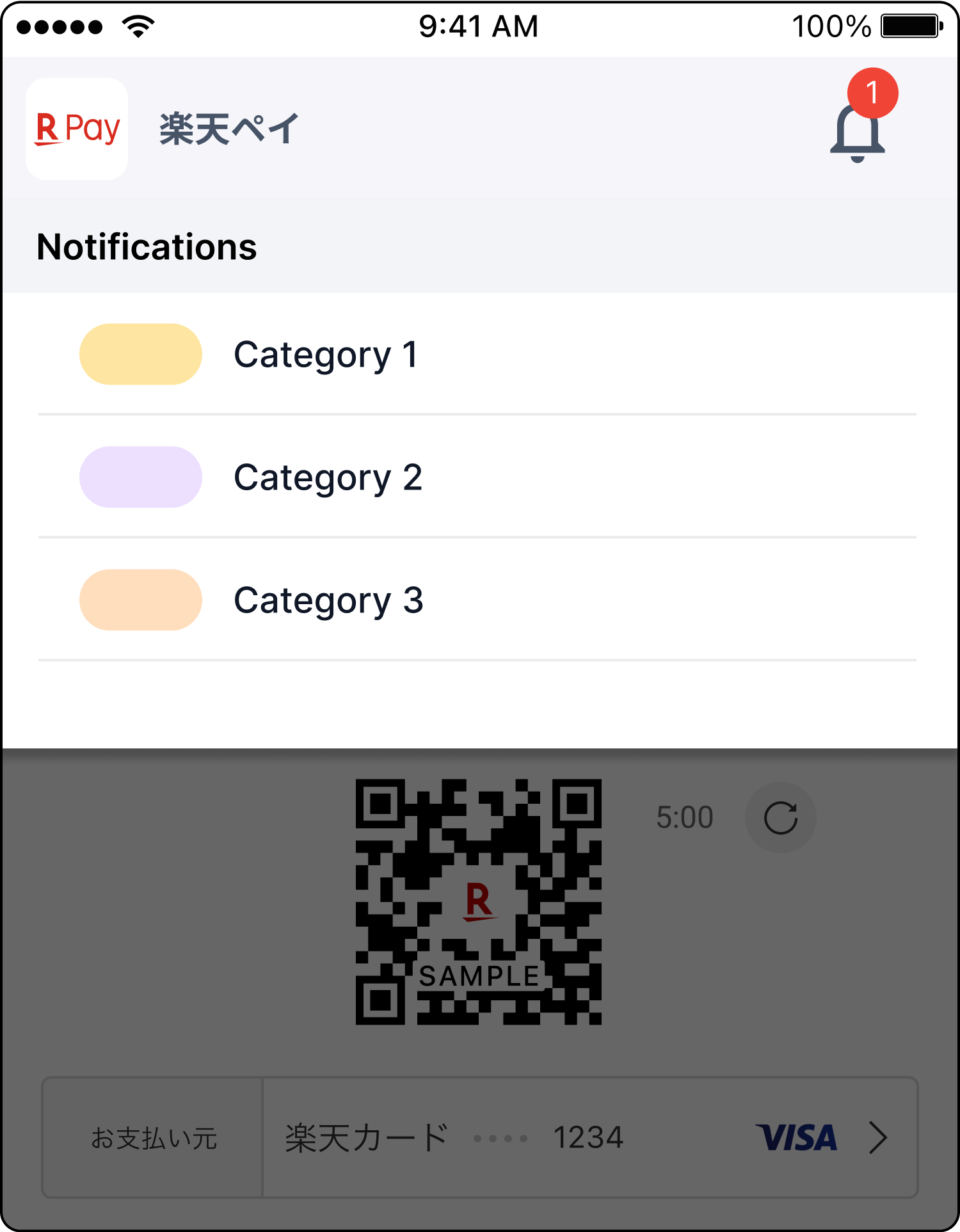
In my previous position as a UX/UI Designer at Rakuten Payment, I led research on a notification area inside a cashless payment app.
The high-traffic app enables Japanese customers to make payments by QR codes.
Upon close inspection it was revealed that there was room for improvement since Information Architecture was not thoroughly explored.
I proposed a research to validate the I.A. of the five categories in the notifications feature.

Overview
Duration: One month
Team: Two UX Designers
Impact: Improved usability, offered clarity to stakeholders at very low cost
How to validate success?
- Finding the bell icon and tapping on categories or messages is not sufficient for this product success.
- If messages were categorized in these drawers, can most of the users find them intuitively without having to open and close each drawer?
- What kind of information do users want to see?
- How do they want it delivered?
- Can they easily find them?
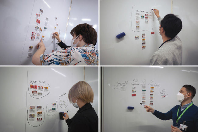
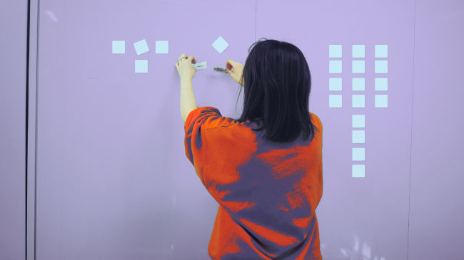
Research Design: Card-sorting
- Gathered 20 sample notification messages
- Made a few trial card sorting versions online
- Put a magnet on each message so users can organize them on a board
- Invited interviewees to organize these messages into any categories that they see fit
- Next, we asked participants to choose labels for categories labels.
- In this exercise, we understood how our users perceive these messages.
Next
- What categories are important to you?
- What kinds of messages do expect to see under the notifications bell?
Outcomes
- Majority of users were not able to recreate the proposed groups.
- They had trouble identifying the nature of some messages
- Users did not want to be "notified" of such offers.
- Users came up with all sorts of groupings based on their needs and prior experiences with notifications.
- Many saw them as spam and the some wanted to pop all campaigns and deals from all sources into one pile.
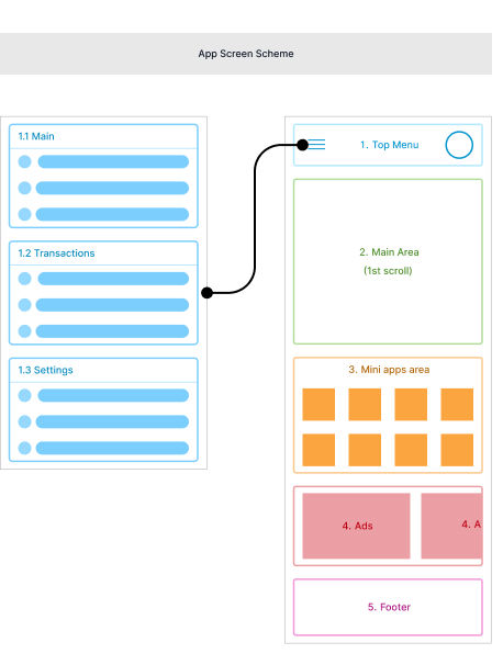
Users were handed a paper featuring a simplified scheme of the app and asked where they would look for such info. On the menu? Under the settings? Together with the other banners? In a separate box on the home.
Takeaways
Most Users do not differentiate between the source of commercial campaigns.
Unlike the designed structure, it did not matter to Users if the offers came from the company itself or other merchants.
- Most users did not care very much about these offers and would not go back more than a few days if they missed them.
- Most Users did not wish to be notified of routine system messages. Examples included automatic system updates or new stores joining the company’s large network of merchants.
- Most users thought of vital system or maintenance announcements as important. But almost all of them thought of them as time-based messages that were no longer relevant when expired.
- Some users said they would look for system maintenance announcements under the main menu or in the settings sub-menu.
- Some users said they expected to see campaigns and offers on the home page not in the notifications area.
Information Architecture research: A 20x20 pecha kucha presentation
Reflection
This research exercise initiated a good deal of healthy debate within the company.
It gave us very rich insights into how users think about these campaigns and offers disguised as “notifications”.
We concluded that not only the proposed groups were inefficient for most users, but it was crucial to provide them with a degree of flexibility to customize their categories (like folders) and hide unwanted categories.