Andook personal financial toolkit
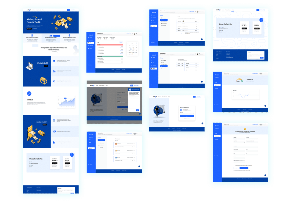
Andook is a privacy-centric app to help users manage personal finances. In this project, I and three other designers created the Andook website as a minimum viable product (MVP) based on the stakeholder requirements.
With this tool, you can view, track and manage your financial life comfortably and securely.
Overview
Duration: Three months
Team: Two UX Designers
Impact: Improved usability, offered clarity to stakeholders at very low cost
Key Features
- Customizable dashboards
- All-in-one account management
- Expense tracking
- Bills management
- Built privacy-first
Money Research
Creating an understandable structure for all of the user’s accounts was a challenge.
While every person manages their money differently, it is crucial for Andook to organize information in a way that is understandable for all users.
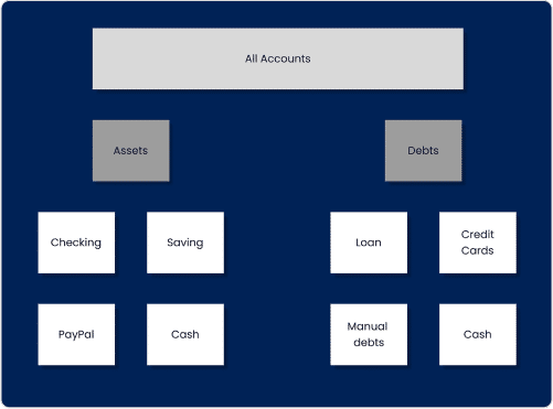
We conducted an open card sorting to structure the information architecture and provide clear and concise labeling.
On the right is a sample of the results we received.

A Reddit user asking the same existential question.
Research questions
- How to organize various accounts in the dashboard?
- What labels/groups can best describe each asset/liability?
- Is Cash money a separate category of equity?
- Is PayPal an asset account or a liability? or both?
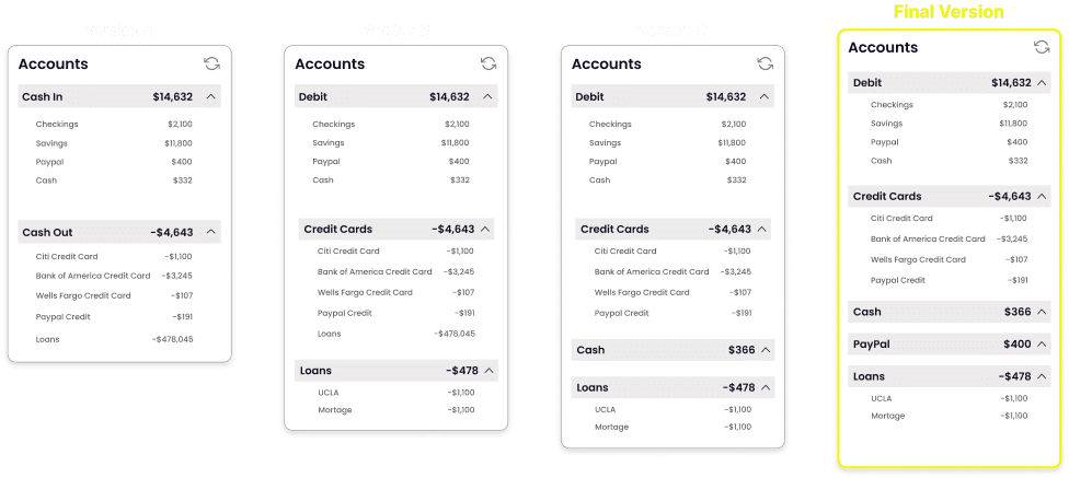
Card-sorting takeaways
- Here you can see some versions of categories based on participants’ opinions.
- After several usability tests, we decided on the following layout.
Onboarding
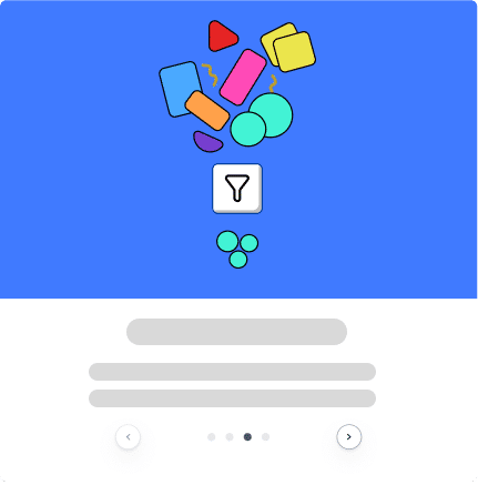
The onboarding clearly demonstrates to users what the features are and how to use them. I built the onboarding steps by animating the logo that I had designed for the brand.
Connect accounts
Adding bank accounts, credit cards or loans in order to manage User’s transactions is a unified and guess-free journey.
Manage transactions
Users can view, edit and manage auto populated transactions.
Users can customize the table by various filters and sorting features. Intuitive modification helps them take control of the dashboard.
The Split feature enables users to break down expenditures into more meaningful purchases.
Design System
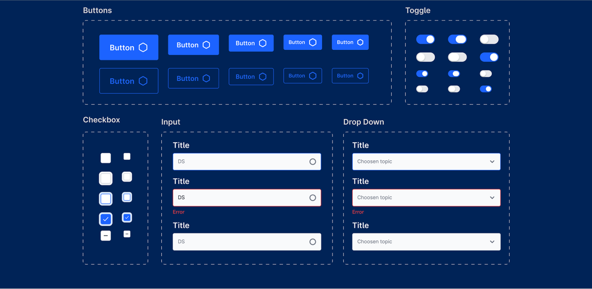
To achieve high quality design, we created a complete design system for Andook, consisting of fonts, colours and various break points for different screen sizes.
Logo Design
Provably non-knowable data.
I deigned the Andook logo to clearly covey the brand’s motto of being a ‘security-first’ financial toolkit.

Andook website UX design preview
Reflection
Andook was my first experience with financial tools. It proved to be a rich playground for me with abundant learning opportunities.
Working on this large project with heavy tabular information design, I learned the importance of Information Architecture and labeling.
If I were to do something differently, I would streamline components and cut the workload with the help of Auto Layouts (which was not well-developed back then).
Thank you!
