Antique Rugs
Antique rugs website re-design
About this project
I re-designed the Mollaian Antique rugs website with my teammates.
The Mollaian store:
- Offers a variety of textiles
- Sells unique handmade rugs
- Has 35 years of experience
- Operates out of 3 branches
* Photos and content are courtesy of mollaeian.com website and other respective owners. No infringement is intended by this unsolicited proposal.
Project Overview
Tools
Figma, Photoshop, Maze, Illustrator, Google Forms
Team
3 people
Duration
6 weeks
My Role
- I was a UX/UI DESIGNER in this redesign project and was involved in every step from ideation to prototyping.
Product
- Desktop website
Problem Statement
The client in this unsolicited redesign project has a poorly organized and outdated website for online sales. They need to redesign their website based on better information architecture to boost the shopping experience and sales.
The process
My team utilized the double diamond concept. It was not a linear path, we bounced between stages as the project progressed.
Heuristic Evaluation
A heuristic analysis of the current website revealed several problems of varying severity.
1. Aesthetic and minimalist design
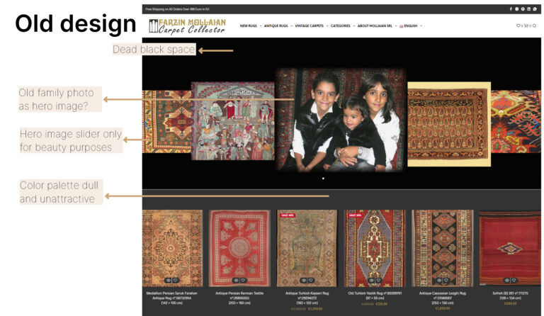
2. Visibility of system status
Out-of-stock products are not marked. No price is written.
There are too many out-of-stock products listed. It feels more like a museum than a store!
3. Match between system and the real world
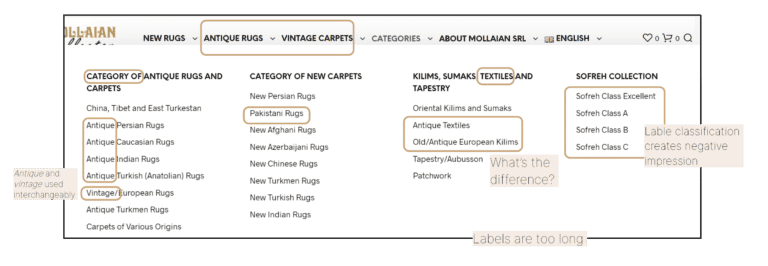
On the navigation bar, the sorting and labels are messy and do not make any sense. User cannot recognize the logic.
4. Aesthetic and minimalist design
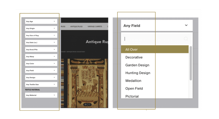
The list of filters is long and too technical.
5. Error prevention
Not all the pages of the products are active.
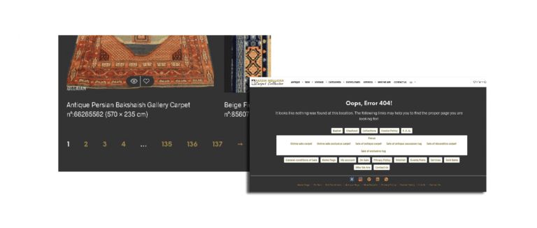
Another heuristic rule was missing: Help users recognize, diagnose, and recover from errors. Some pages return errors.
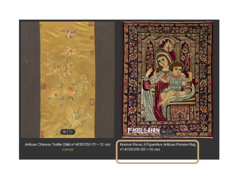
6. Recognition rather than recall
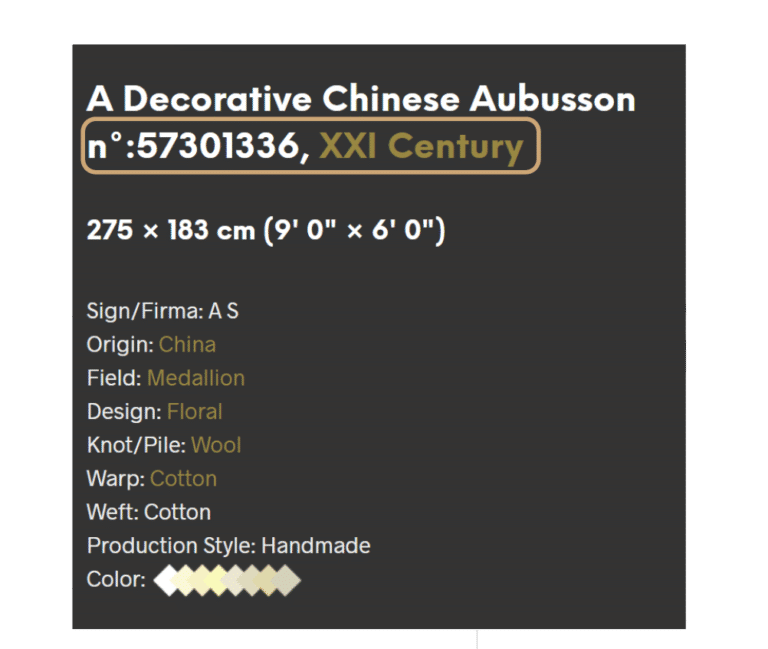
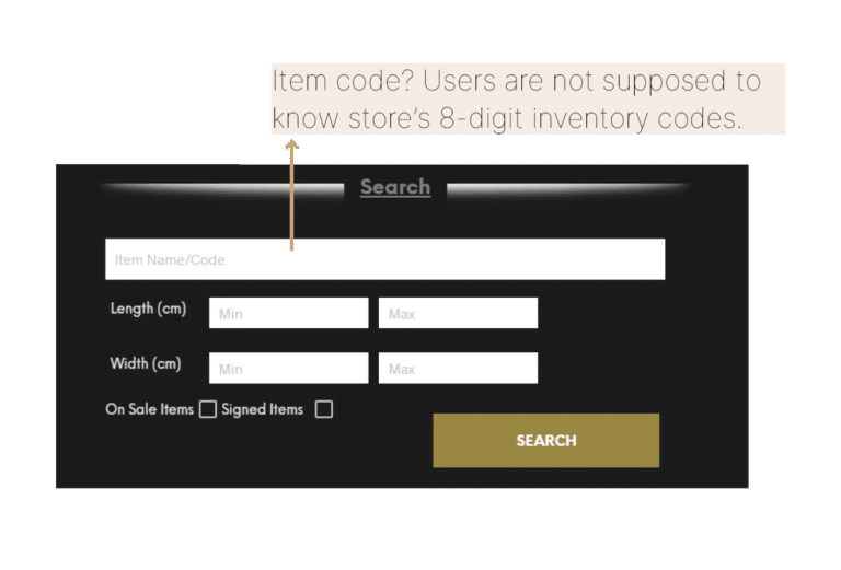
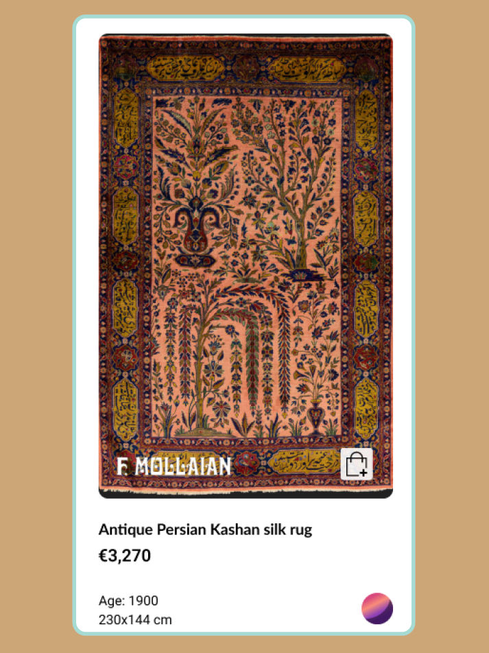
A meaningless number in the product title makes recognition difficult. Next to the rug’s age, the numbers confuse the user.
7. Flexibility and efficiency of use
No search criteria available except size.
8. Consistency and standards
UX writing problems. Content sometimes appears in different languages mixing English and Italian.
9. Visibility of system status
Expired events are advertised.
10. User control and freedom
The back button doesn’t work properly on all pages.
Competitive analysis
We compared four similar websites to better understand where we are standing compared to the market.
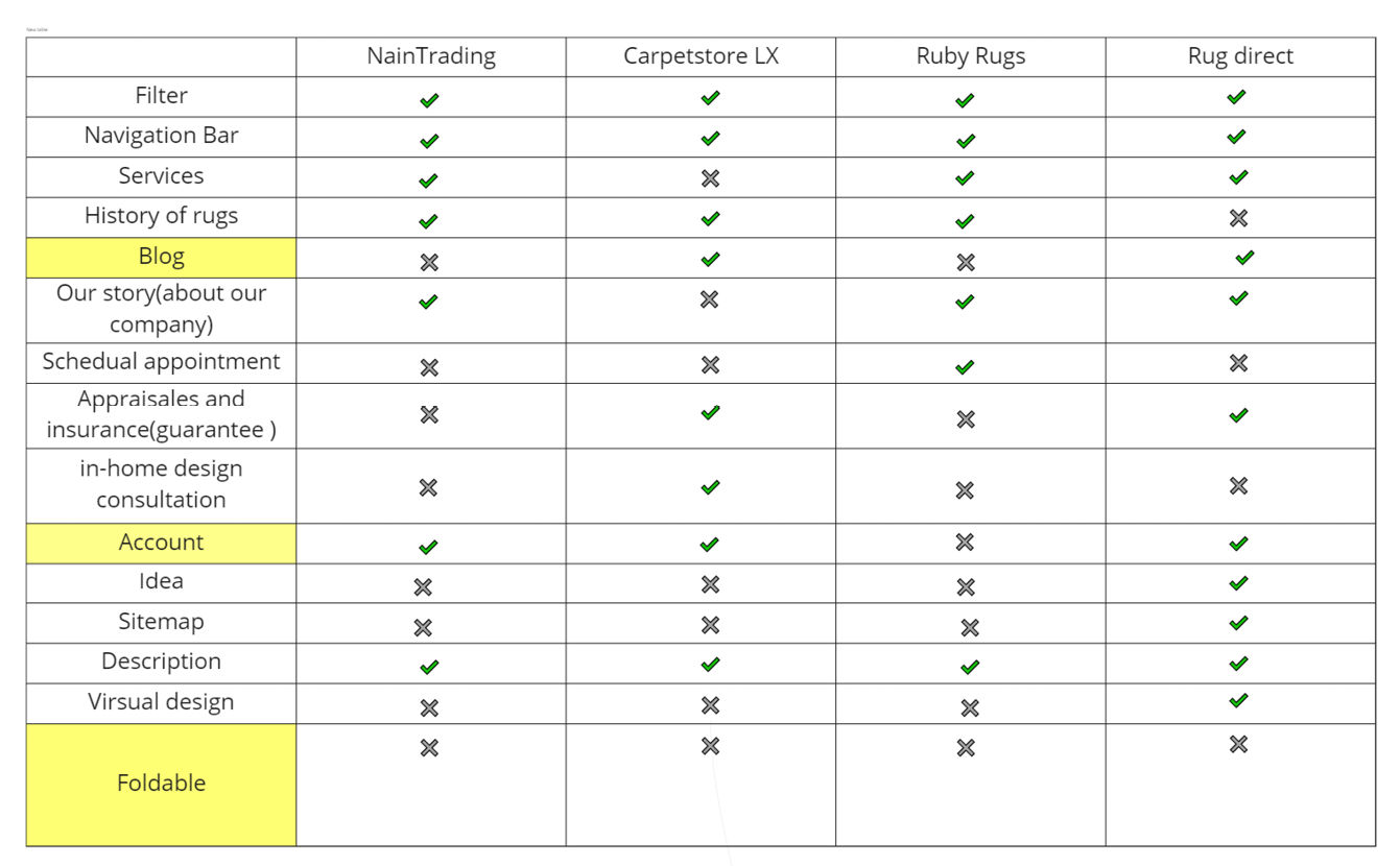
Major Takeaways
MUST ADD
To add a personal account section
Having a blog can help customers choose better
MUST CHANGE
Old-fashioned look
GOOD TO CHANGE
A more interactable user interface
Lack of information about rug thickness (foldable or hard)
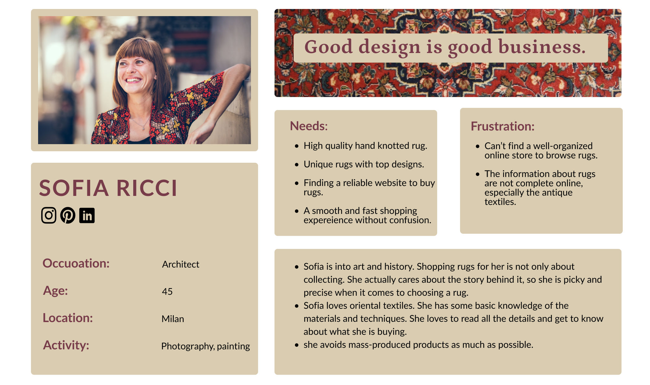
Persona
User flow
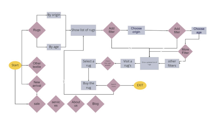
We mapped out the easiest and most efficient user flow that a user needs to go through
Affinity Diagram
To research the labels and site map we asked 10 users to sort the cards.
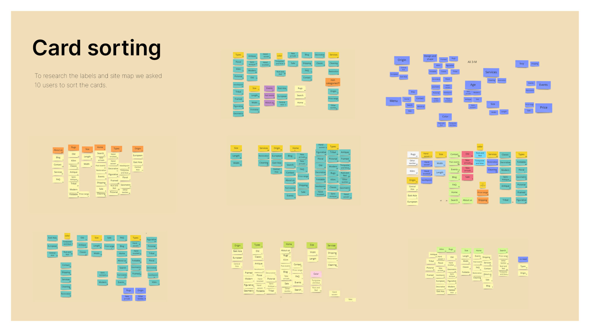
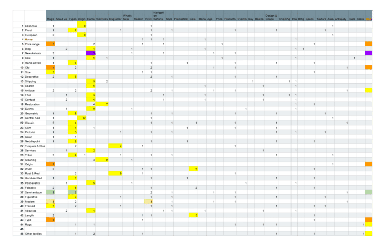
Card sorting results
Information architecture was designed based on card sorting results.
Information Architecture
Open card sorting: 10 participants
Some design flaws were revealed, including the ease of navigation in the navigation bar. So, we re-designed it.
Rug age
Users found “Antique” and “vintage” labels as confusing.
So, AGE was simplified to four clear levels:
- Antique
- Semi-antique
- Modern
- Old
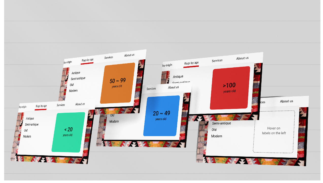
ITERATION
Some users were still unsure about the distinction. They mixed up antique and old.
RESULT
Age categories were quantified with distinct colors in the form of mouse over tips to leave no room for mistake.
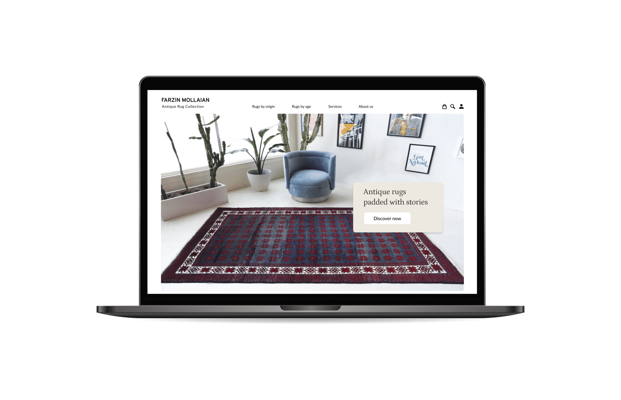
Hi-fi iteration
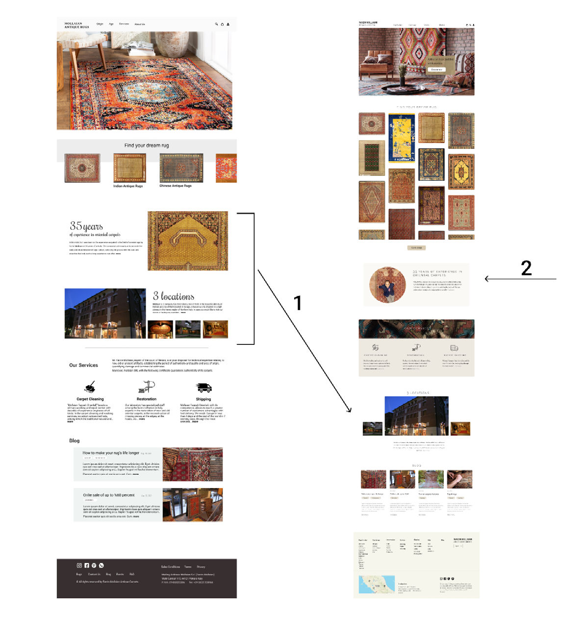
After running a usability test, these iterations were agreed upon:
- Users didn’t pay much attention to the locations, so it was made smaller and put lower.
- Users did read the story of the creator so it was brought to the center with a photo of the owner to make it more personal and relatable
- Laying out photos up front helped users better realize if this is what they were looking for.
- Users needed a CTA to take them directly to the products page.
- Services were moved higher with more clear icons and less text.
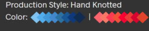
Rug color palettes
Current design has separated colors, showing their shades.
Users did not find this solution useful. They only saw the main colors. e.g. blue and red.
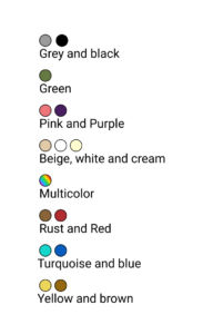
Solution
Shades were discarded.
Adding labels helped user recognition and searchability.
But separate colors did not look real for normal people.
Iteration
To merge all the info in a compact and appealing form, I created orbs out of the rug color palettes.
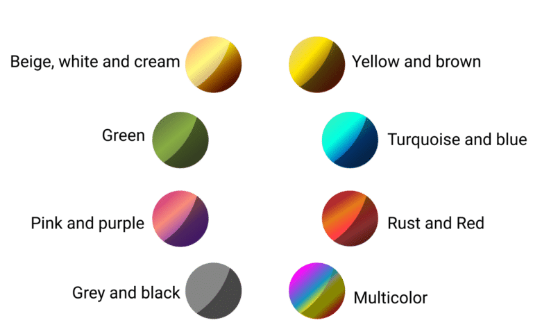
Result
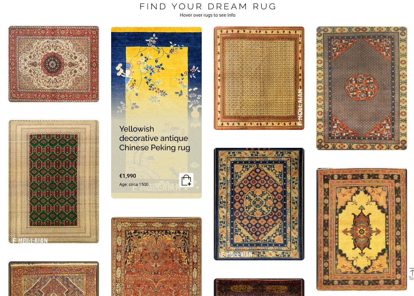
Rug category display
Previous design of categories page did not invite users to interact
Iteration
Focus on category was removed as it is accessible in the menu.
Instead, rugs were put upfront with an elegant and minimal design.
Hovering on each photo shows info.
Result
New design adds dynamism and visual appeal.
It engages users directly with products.
Users feel empowered to view info and add product to cart directly.
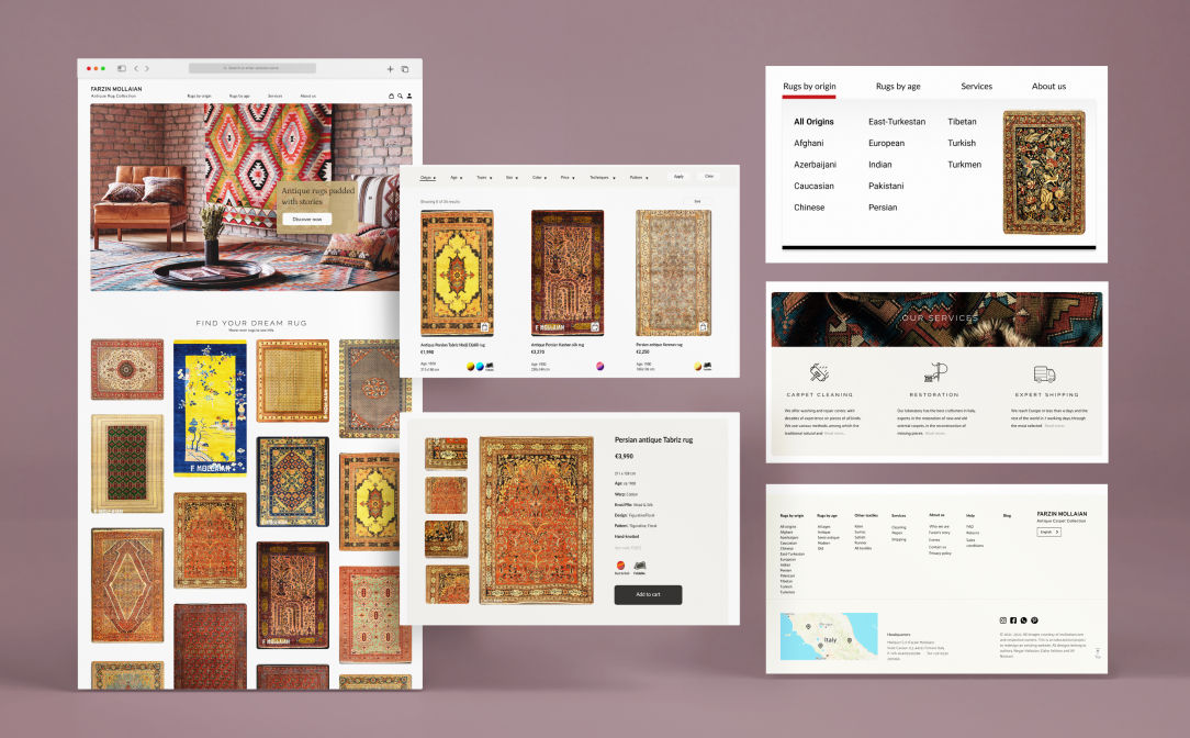
High Fidelity Prototype
A functioning was created based on the findings. Several rounds of iterations were conducted to fix errors and fine-tune the product.
Outcomes
Our final design reflects the learnings that we achieved during our discovery and development steps. Users wanted a more modern and user-friendly design, reflecting that need.
By removing unnecessary categories, streamlining the navigation, and improving the user interface and information architecture, we improved the user experience.