LiveUp
Upcycling furniture web application

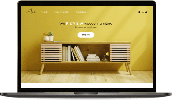
What is Live up?
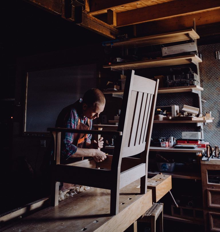
- “Live Up” is a CARPENTRY WORKSHOP that renews wooden old furniture to the owner’s desire and RECYCLES USABLE WOOD WASTE INTO NEW FURNITURE.
- Live Up cares about the ACTUAL LIFESPAN OF THE WOOD rather than the commercial lifespan.
Why Renew?
- Wood products reach their actual lifespan
- Reduces the need to cut down trees
- Old pieces with valuable stories can be maintained and reused with a fresh look.
Project Overview
Tools
Figma, Photoshop, Miro, Illustrator, Google Forms
Team
3 people
Duration
5 weeks
To put what I learned from my UX/UI courses into action I designed an e-commerce website with two of my classmates. Our interest in SUSTAINABLE BUSINESSES AND CARE FOR NATURE led us to create “Live Up”.
Key Deliverables
- Business goals
- User journey
- UI kit and branding
- Hi-fi Prototype
My Role
- As a UX/UI DESIGNER, I was involved in every step from ideation to prototyping.
- I also designed the LOGO for this brand.
Design Goal
- To create an Empathetic and unique design.
Objectives
- Encouraging users to buy sustainable products by showing how UNIQUE AND USABLE renewed products can be.
- Introducing our new service, renewing client’s old wooden furniture, in a way that MOTIVATES USERS TO TRY IT.
Product
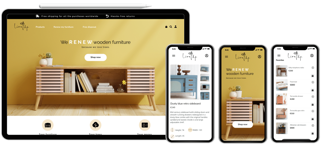
- Desktop and mobile website
The Brand's Value Proposition
Live Up. One tree, many stories.
We make old and valuable wooden furniture prettier and more usable.
We take into account the actual lifetime of a product and believe that wood waste can be greatly minimized by upcycling woodcrafts and furniture into different usable products with new looks. We care about the story behind every piece and we think they are mostly worth maintaining.
We started by asking the stakeholders some initial key questions.
Who?
1- Who will the users be?
- People who have old furniture pieces with sentimental values and want to maintain them.
- People who want to buy new furniture while protecting the environment.
2- Culture
- Those who care about the environment
- Those who prefer unique items with stories rather than mass-produced pieces.
Where?
- A small workshop in Europe.
When?
- When they need their furniture to be renewed.
- When they want to buy a renewed unique item.
What?
1- What products should be sold on the website?
- Renewed furniture.
1- What services would the website provide?
- Renewing people’s old wooden furniture.
- Free pick-up service for wooden items that can be salvaged.
- Selling renewed furniture sourced from various paths.
Why?
Why would people renew their worn-out furniture?
- Increase the lifespan of their furniture
- Reduce costs
- Keep using an item with sentimental value
- Contribute to saving trees

User Research
We began by designing a survey asking to answer a few key questions via Google Forms. A group of over 60 people responded.
User Pain Points
- Difficult to trust the quality of upcycled furniture in online shopping
- History/story of the furniture unclear
- Having the option to choose between a collection of renewed products
- Not good return policy
- Concerns for expensive shipping
Probable Solutions
- Build positive energy by the experience of past users
- Create a good experience in shopping for renewed furniture
- Show the variety of our products in a pleasant way
- Increase sales by highlighting features like free shipping and return policy
- Share the details of furniture’s history
Survey Results
To better understand customer needs, we conducted a survey. A group of 63 people responded most of whom were women. Around 80% of respondents were between the age of 20 and 39 and some 65 percent of them were married.
4 GEMS WE FOUND IN THIS SURVEY
GEM 1
Through the survey, we found that the majority of respondents were environment-conscious and did think about reducing their impact on earth when shopping. That was good news!
GEM 2
Most of them do have a piece of furniture with sentimental value in their family that needs renewal, and more interestingly, most of them think about having them renewed.
GEM 3
The majority of respondents said they may consider using a service to turn their old furniture into something more stylish and practical.
GEM 4
Additionally, we found that the majority of people do not use bulk waste disposal services, meaning that there is an opportunity for us to pick up their unwanted wooden furniture and use it as material for renewed products. This would take the burden of disposal off their shoulders and provide a steady source of used wood for the workshop.
Competitive analysis
Searching and asking around for websites offering renewed products or furniture renewal services, I realized that there weren’t many websites focusing on this area. There are a few websites in the upcycling business and some of them are focused on selling DIY tools.
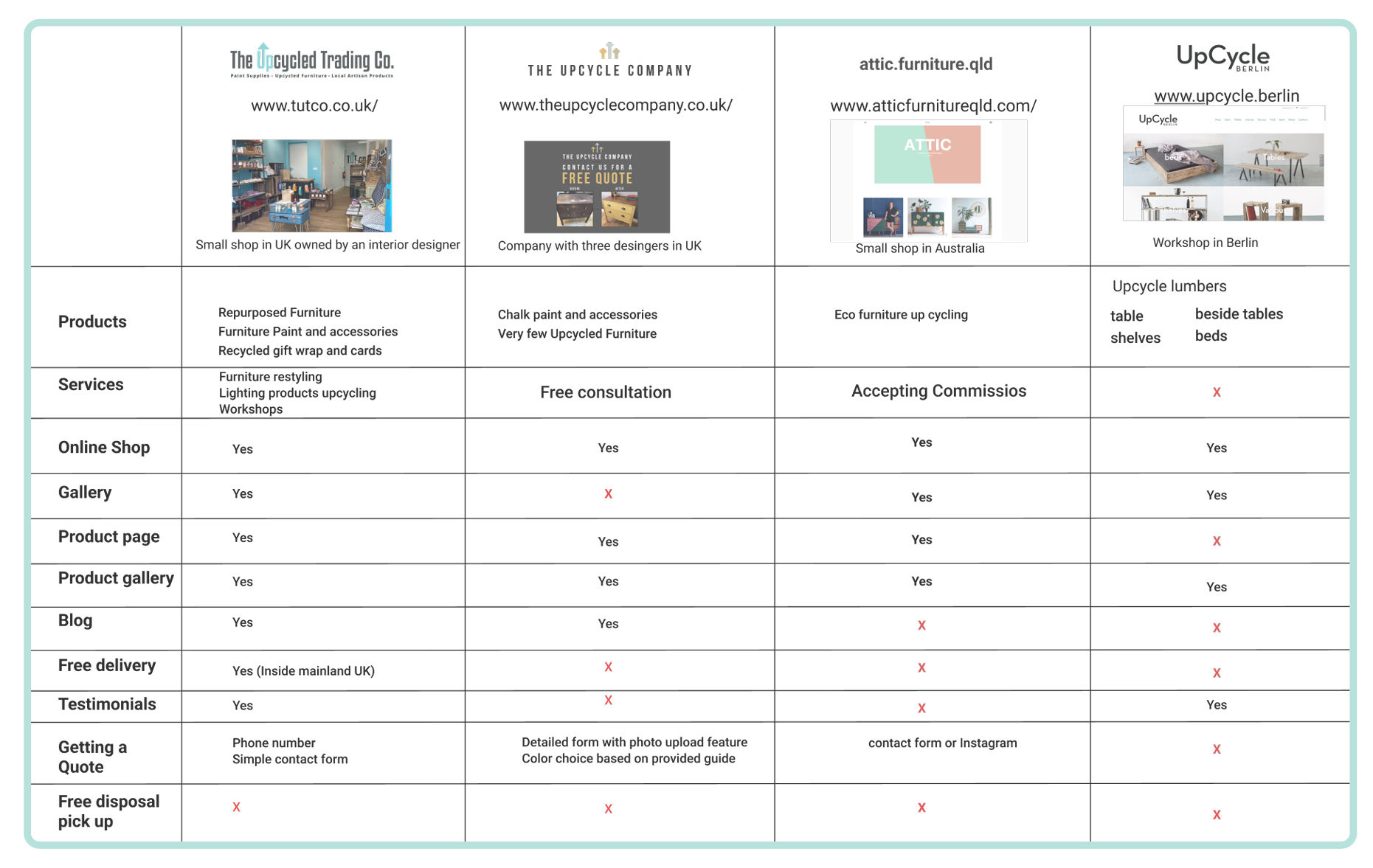
The competitive analysis helped us identify key features offered by the competition.
Major Takeaways
The only competitor in Europe was in Berlin and the others were in UK or Australia.
UPCYLE.BERLIN seems the most comprehensive competitor.
- It nicely emphasizes its business values by a counter of how many trees were saved.
- They have useful information about the process with photos and gifs dispelling many concerns.
- They show the eco-friendly nature of their company by emphasizing lumbers sourced from construction companies.
- They also have a virtual tour of their workshop. Nice to have.
ATELIER TUTCO offers beautiful photos of the renewal process that feel friendly and professional.
THE UPCYCLED COMPANY has a detailed quote page where users can input their desired colors and design.
ATTIC FURNITURE takes lovely photographs of her pastel-colored works in minimal sunlit settings.

Affinity Diagram
We interviewed five respondents who were ready to talk more about their opinions and came up with an affinity diagram to lead our design process.
Price
Product quality
Delivery
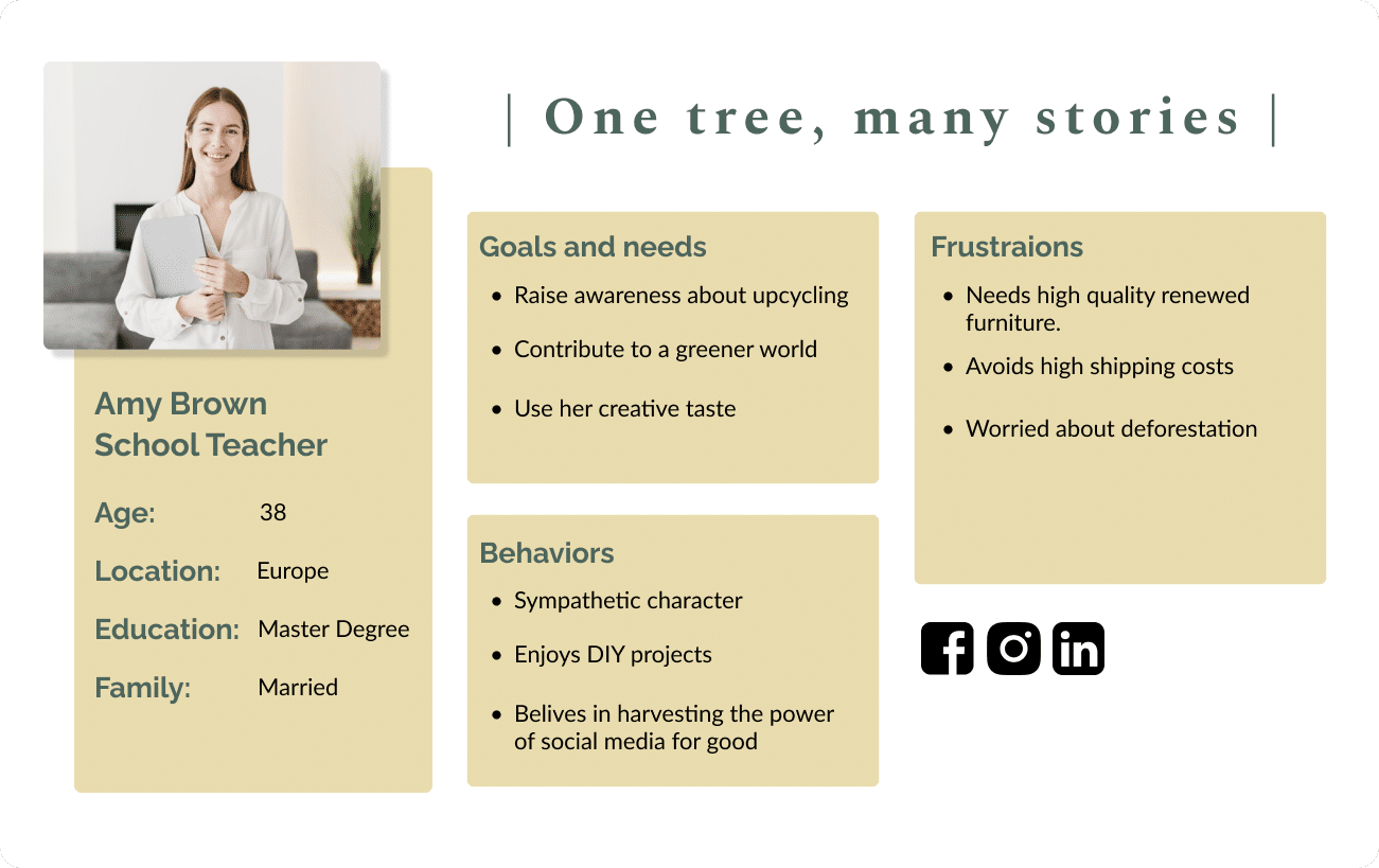
Persona
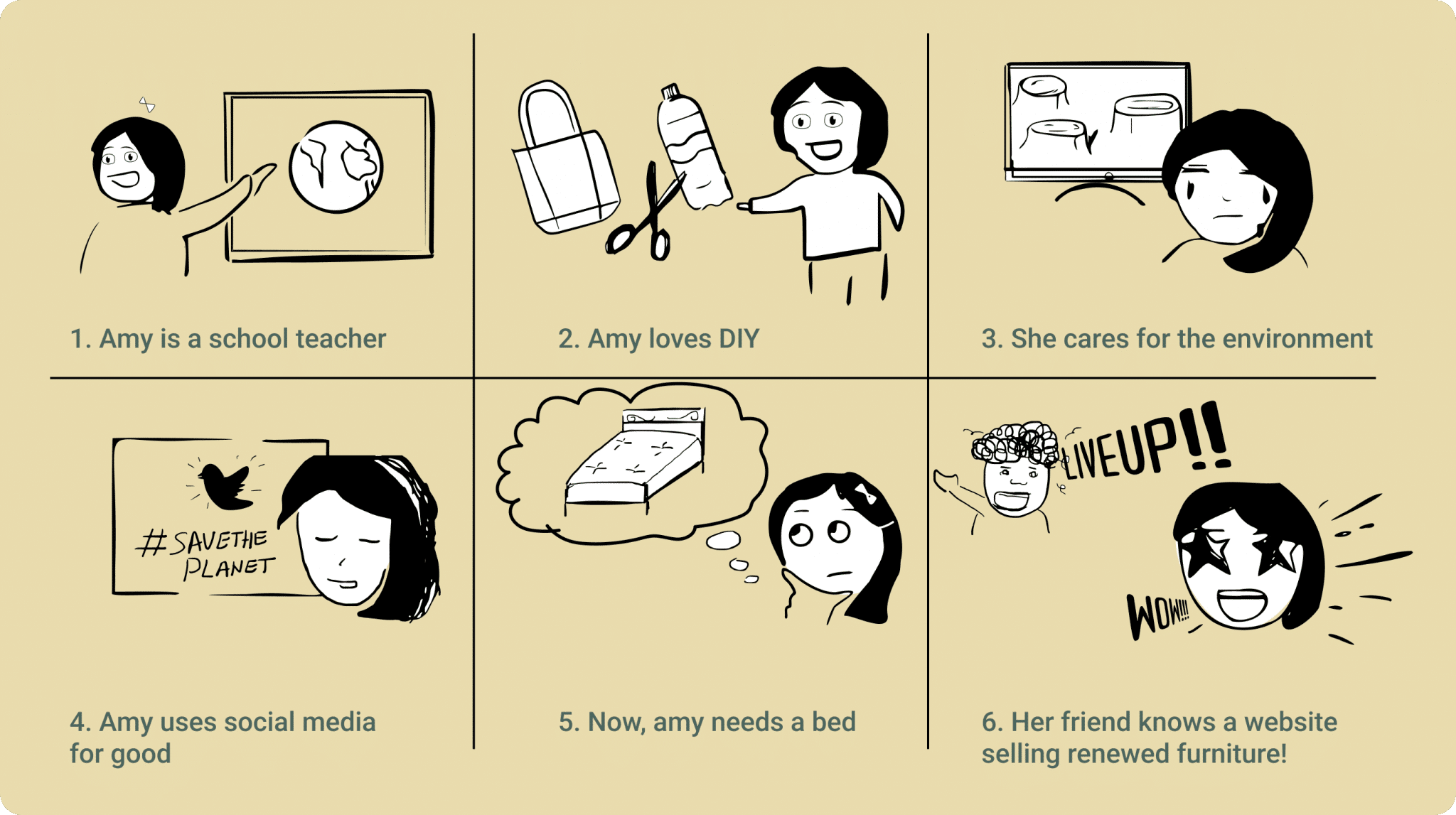
Storyboard
This was my first visual storyboard. It was fun to try and convey the context with pictures. I believe stories are very powerful.
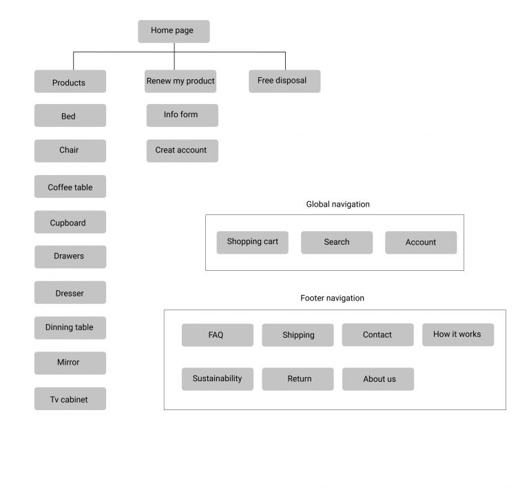
Sitemap
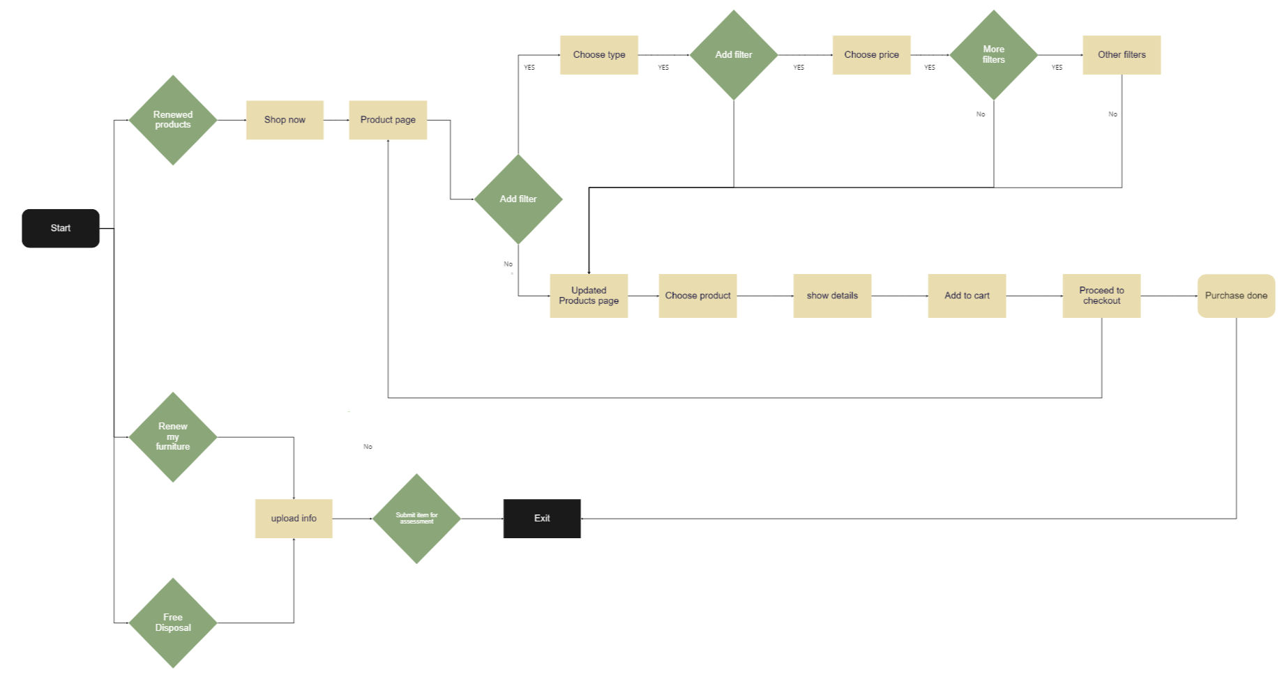
User flow
Shows a user's interaction journey from the beginning of the purchase.

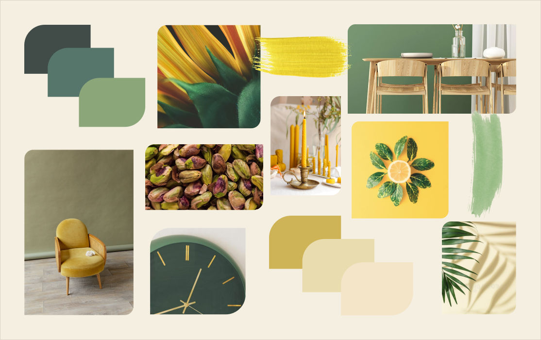
Moodboard
The moodboard was used as a reference for color choice, design elements, and the overall feeling of the design.
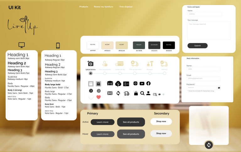
UI Kit
As I moved forward, I made sure to gradually create, complete and update our design system in the form a UI Kit.
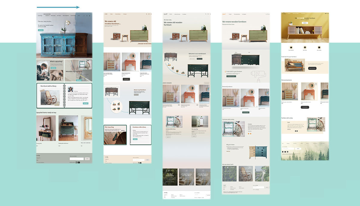
Iterations
We went through numerous iterations based on actionable feedback during usability tests.
* One challenge was how and whether to show a before/after picture in the hero section both to inform the user and keep the clean look.
High Fidelity Prototype
