Creating an accessible 10-color palette for color-blind users at Rakuten
Objectives
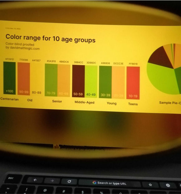
- Create a palette of 10 colors for the marketing view dashboard at Rakuten company.
- Target Users: To be used by a wide range of merchants from all demographic groups.
- Use case: Showing in the best way the different age groups for an easy and quick visual interpretation of data.
- Emphasis: Make color palette accessible for people suffering from weak eyesight or color blindness.
Method
The initial palette was eyeballed through trial and error and repeatedly checked for color-blindness accessibility. To test, the Color Blind plugin (By Sam Mason de Caires) was used in Figma.
But the random method was inefficient and time-consuming.
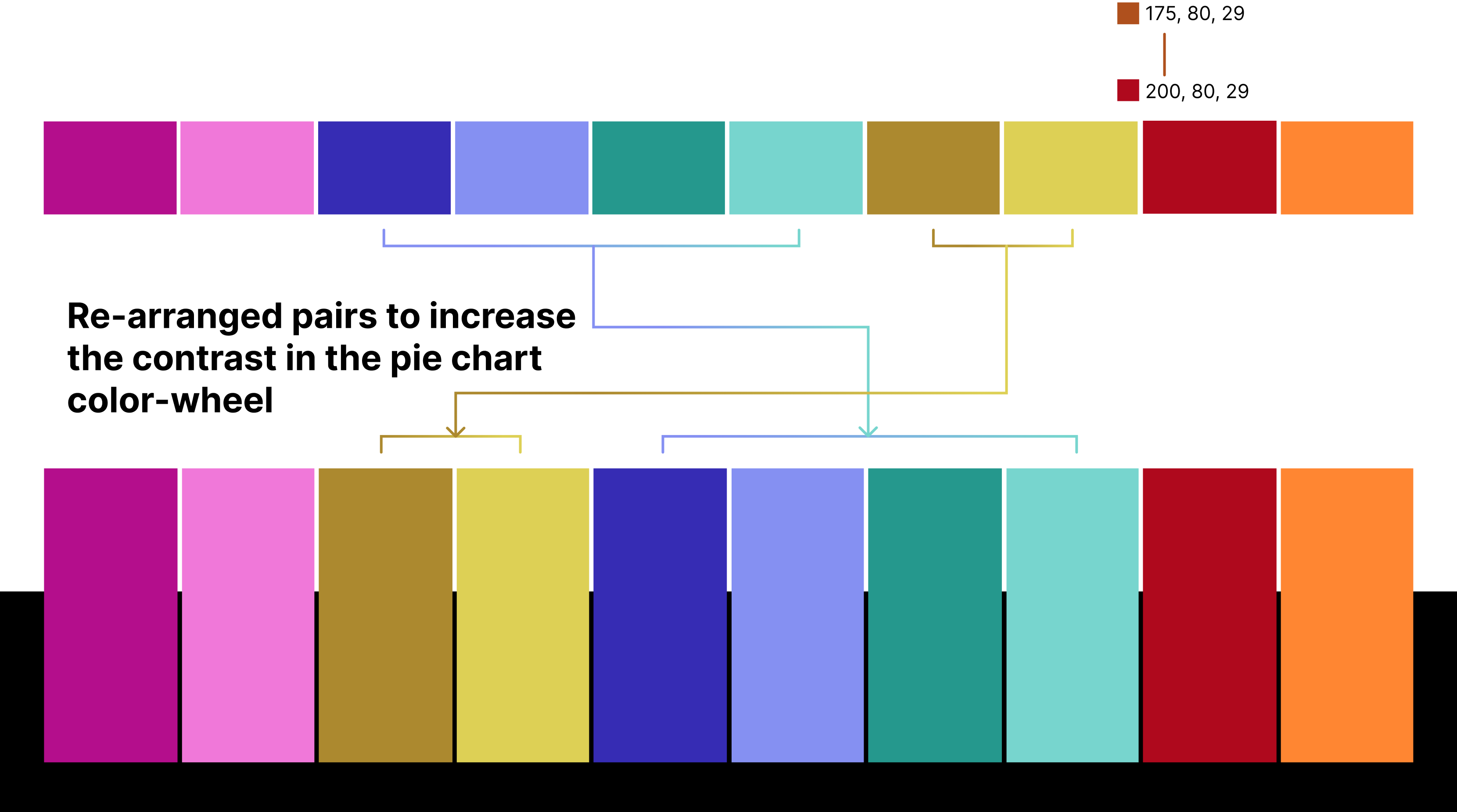
Then, pairs were adjusted methodologically based on HSL (Hue, Saturation and Luminance) and HSB color systems (Hue-Saturation-Brightness) to build distinction between color pairs that looked similar in some color-blind tests.
The initial palette was eyeballed through trial and error and repeatedly checked for color-blindness accessibility. To test, the Color Blind plugin (By Sam Mason de Caires) was used in Figma.
But the random method was inefficient and time-consuming.
Then, pairs were adjusted methodologically based on HSL (Hue, Saturation and Luminance) and HSB color systems (Hue-Saturation-Brightness) to build distinction between color pairs that looked similar in some color-blind tests.
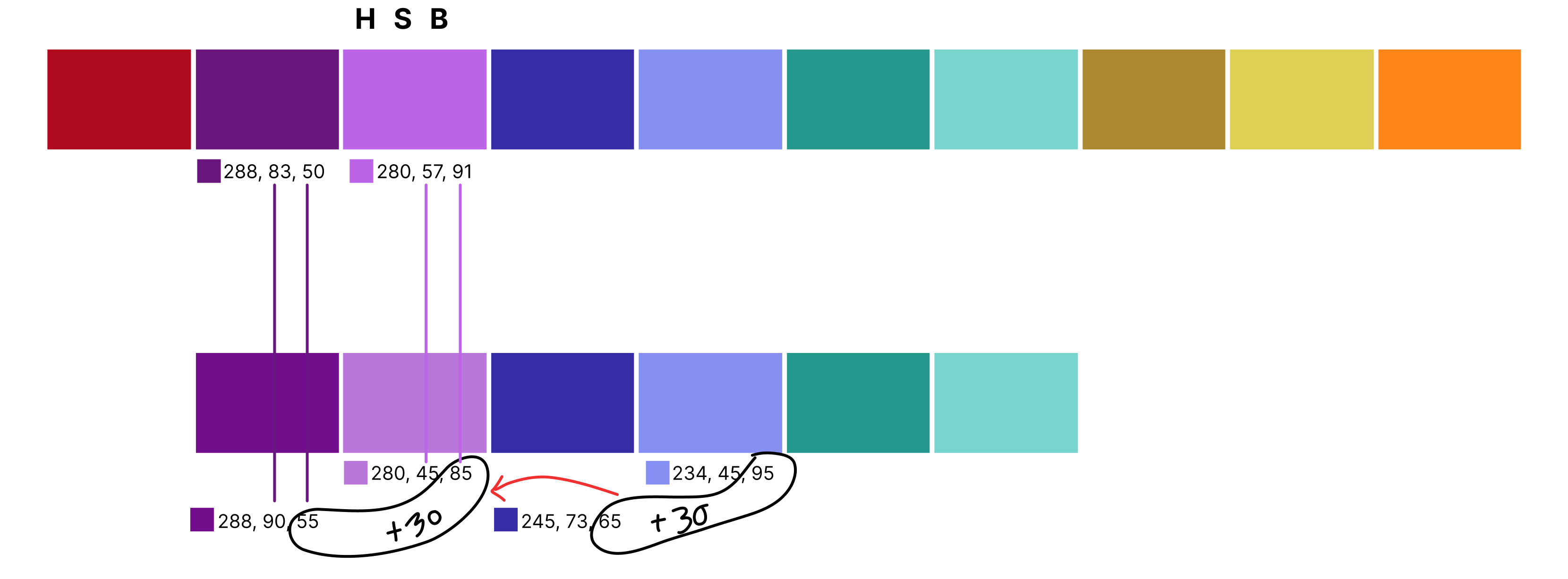
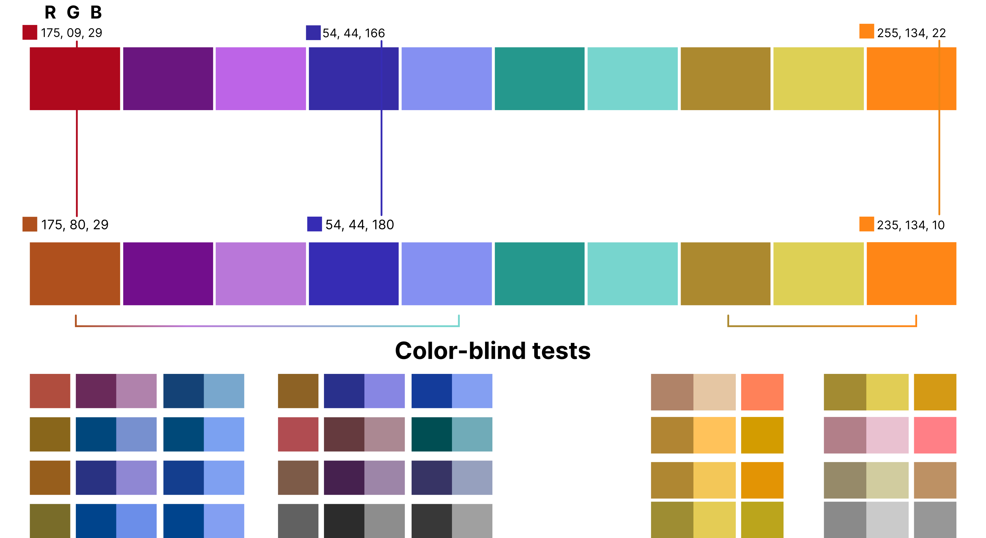
HSB proved very helpful in contrast building but was no longer enough to make fine adjustments. Red-blind tests still had trouble, so the Green and Blue channels were adjusted to make a difference.
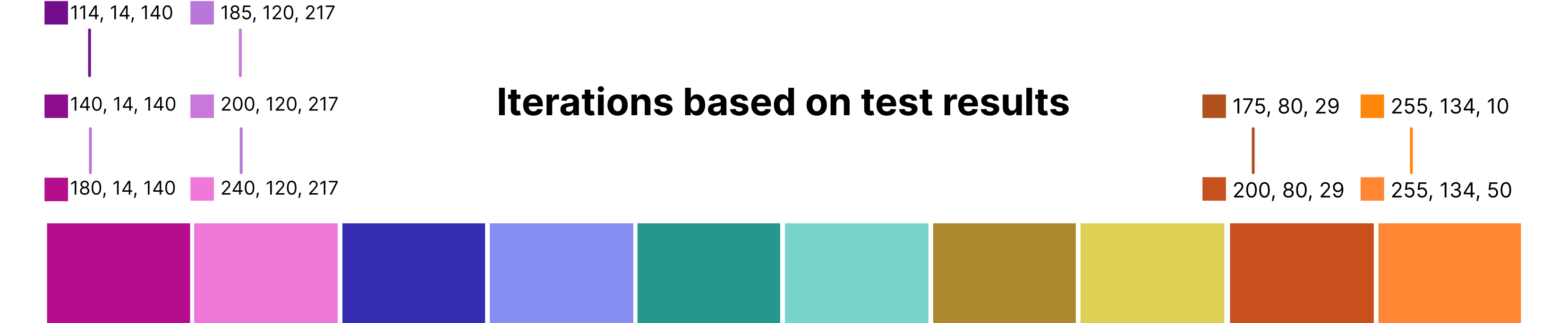
Pairs further adjusted based on RGB color system
Conclusion
Creating an accessible 10-element color palette seemed challenging at first -- and it was.
There are many accessible palettes of up to 5 colors on the web but when put together many problems arise and you end up with duplicate looking hues in color-blindness tests.
Achievements
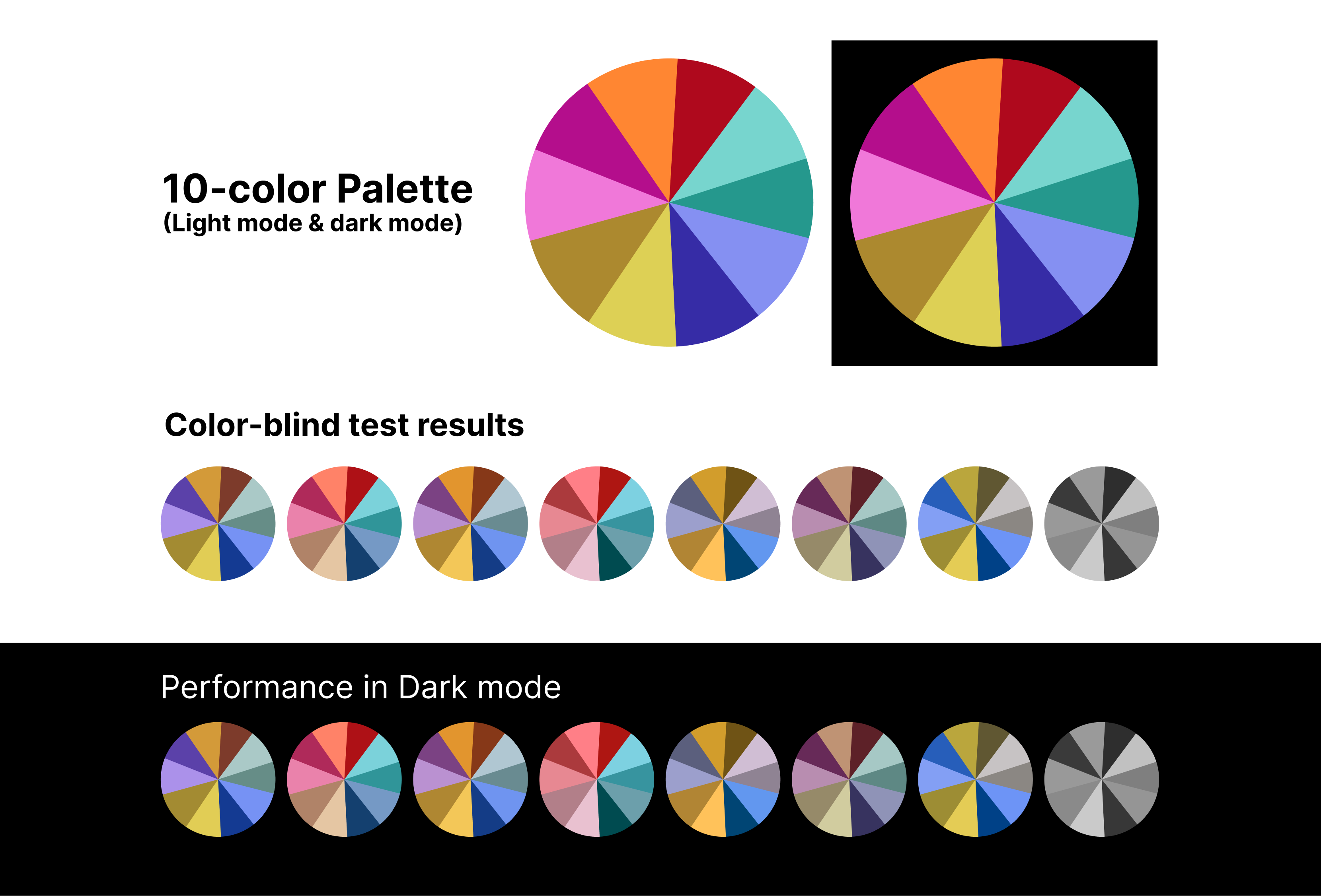
- Accessibility results are not perfect but very satisfactory.
- Good contrast is achieved in the chart.
- Colors are distinguishable in most scenarios.
- Rearranging items to achieve the best next-to-next contrast and hue proved useful.
Caution
Even existing standard palettes used in subway maps cannot provide 100% accessibility for all color-blind people when it comes to palettes of 10 or more colors. The red-blind is the weakness of this palette with two close pairs. The issue can be minimized by setting one of the red-blind-weak pairs to the smallest fraction on charts.
Key Takeaways
Digging deep into a problem that most people do not seemed interested to take on was very rewarding.
- This project was very challenging. Understanding how color blindness works seemed daunting at first and it took a long time to come up with a system to tweak the palette. It seemed random and disapponting before I started working in HSL, HSB and RGB systems. But as I persevered and tried all options, I was finally rewarded with an acceptable solution.
- Setting a comfortable layout to study and display the iterations that is manageable was difficult because I had no prior experience in this project.
- This is definitely a work in progress that should be further challenged by everyone; experts and newcomers alike.