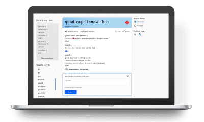
A new home for Canadian English Dictionary
An industry partnership between Canadian English Dictionary and Toronto Metropolitan University
This case study explores the design and implementation of the first comprehensive digital dictionary tailored to Canadian English in over 20 years.
As the lead designer, I embarked on this project to bridge a gap in Canada’s linguistic resources by celebrating the unique characteristics of Canadian English.
In close collaboration with stakeholders and under supervision of professors, we aimed to create an inclusive digital platform that reflects the diverse ways Canadian English is spoken and written across the country.
Project Overview
Role: Lead UI/UX Designer
Duration: 5 months
Team: Four (including me)
Objectives
-
Highlighting Canadianisms
We aimed to preserve and celebrate Canada's unique linguistic heritage by emphasizing Canadianisms and regional language variations. These markers of national identity distinguish Canadian English and reflect its rich cultural and historical context. -
Supporting Canada’s Diverse Demographics
Recognizing Canada's growing and increasingly diverse population, we sought to create a resource that would aid language proficiency, especially for racialized immigrants. Our goal was to make the dictionary an essential tool for overcoming language barriers and facilitating better integration. -
Applying the Science of Learning
To enhance user engagement and retention of new vocabulary, we incorporated Science of Learning principles. We focused on active learning, meaningful interaction, and social engagement to create a dynamic and effective educational tool.
Research
Interviews
To start the journey into perceptions of Canadianisms, we conducted a video survey at Yonge and Dundas Square in Toronto.
Respondents were asked about their familiarity with specific Canadian terms and whether a dictionary focusing on these terms would be useful.
This simple approach provided authentic feedback, highlighting the need for a comprehensive resource for Canadianisms.

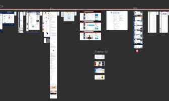
Competitive analysis
We conducted an in-depth analysis of existing online and print dictionaries to identify standards and market gaps.
This analysis highlighted key strengths to keep and common weaknesses to avoid, such as inconsistent entries, disruptive layouts, and poor usability.
Bonus
A notable finding was a suggestion from a interview participant from Newfoundland to design for regional language differences across Canada, emphasizing the localized nature of certain terms.
Survey
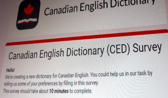
After initial interviews and competitive analysis, we conducted a survey to understand the preferences and needs of potential users of a Canadian English dictionary.
From around 40 responses we gathered demographic info and insights into dictionary usage habits, interest in Canadian-specific content, and preferences for features. The survey also explored users’ experiences with existing dictionaries and their knowledge of Canadian words and regional variations.
By collecting diverse user feedback, we identified key features that users value and areas where current dictionaries fall short. This data is crucial in guiding the development of a user-centered, relevant, and practical Canadian English dictionary.
Survey Outcomes
During our survey, I noticed two different opinions about the entry page:
- Majority: Interactive, feature-packed
Most users wanted the website to be easy to use and packed with helpful features. They liked the idea of a modern, interactive experience that works well online.
- Minority: Barebone, no bells and whistles
A smaller group of users preferred a more traditional dictionary. They wanted a simple version without extra features, similar to old print dictionaries. They valued straightforwardness and clarity over additional functions.
So, I set out to give them not only what they want but actually tools to control their experience.
Dual-Layout on Entry Pages
Our user survey revealed diverse preferences among potential users of the Canadian English Dictionary.
To address this, we implemented a dual-layout strategy that caters to both modern and traditional user needs.
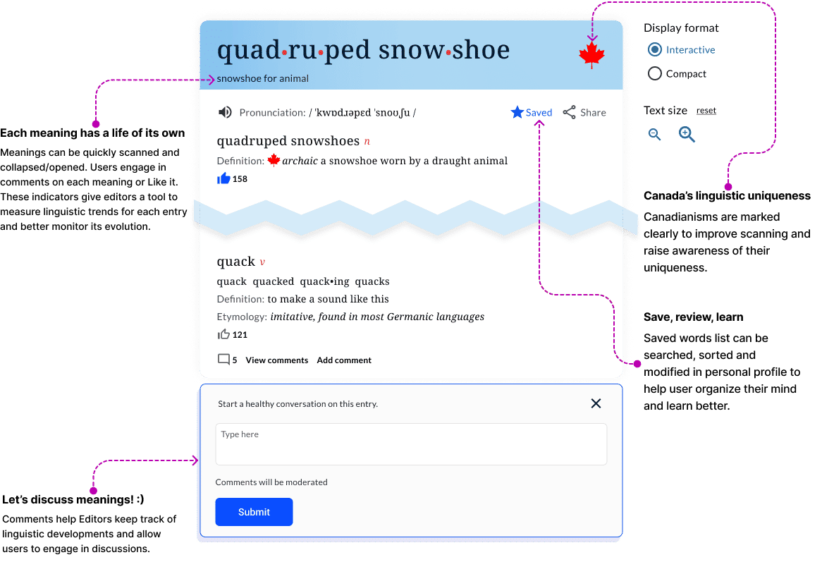
1. Interactive Experience:
This layout is designed for users seeking a modern, feature-rich interface. It includes:
- Easy Scanning: Users can quickly browse through multiple meanings and definitions.
- Interactive Elements: Features like user comments, Like, Save and Share functions, and collapsible Meaning cards to improve focus on target connotations create an engaging experience.
2. Compact mode:
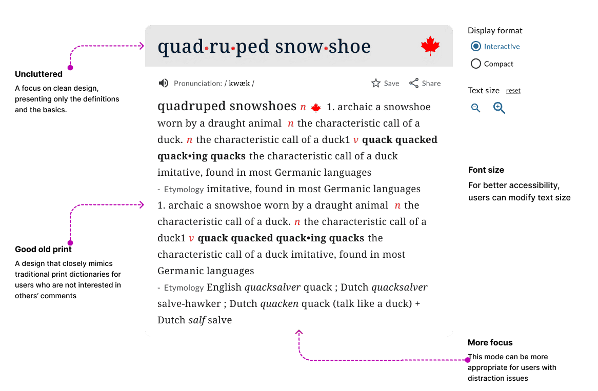
For users who prefer a more traditional, minimalist approach, this layout offers:
- Uncluttered Interface: A focus on clean design, presenting only the definitions.
- Larger Default Font Sizes: Enhanced accessibility, particularly for older users.
- Print-Like Format: A design that closely mimics traditional print dictionaries for familiarity.
Autonomy
The dual-layout approach aligns with the principle of user control, allowing users to choose the experience that best suits their needs.
It is more inclusive for all users with different levels of technology knowledge/interest and also accommodates people with visual impairments or distraction issues.
Making lists work
A dictionary is not only a reference tool. It also plays an important role in education.
For this project, I researched science of learning theories to maximize learning and retention of vocabulary.
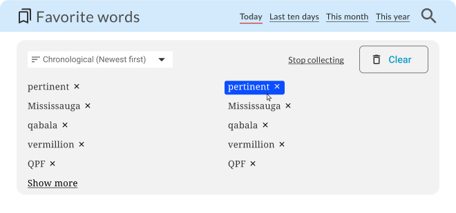
In our user research it was revealed that users found Words Lists static and hard to engage with as they got longer. So they often did not return to them even though they set out to use them more often.
So, I created more relevant filters and functions for the favorite words list, to better user engagement and help them recall previously Saved words.
Testing and Iterations
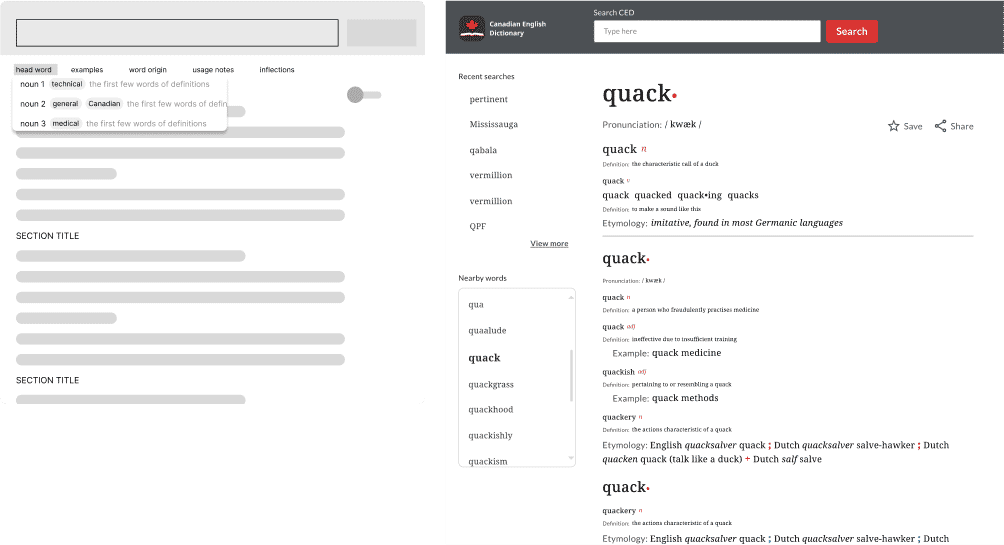
We went through numerous iterations from wireframes to the hi-fidelity stage.
Usability testing: At each stage, usability testing was conducted to pinpoint areas of opportunity.
Gem 1: Through discussing some of the words, I found that users were interested in some of the quirky meanings and usages and were eager to talk about it at length.
This led us to add the comments section, which allows users to interact with the dictionary and other members of the public about the language.
Gem 2: One user was amazed to learn the derived meaning of a word has taken over to become the first meaning that comes to mind.
This prompted discussions with stakeholders on how to arrange an entry’s hierarchy, causing us to set limits on the level of flexibility for rearranging meanings.
Future Enhancements
Advanced Search with Canadianism Filters
In the next phase, I propose to introduce advanced search filters
that prioritize Canadianisms, enabling users to easily find and
explore words unique to Canadian English. This will provide a more
targeted search experience, benefiting researchers, educators,
and language enthusiasts.
Canadian French Version
This MVP phase has receieved tremendous support from the public
with some of them expressing a wish to see the same for Canadian
French. It would be great to develop a Canadian French version
of the dictionary to reflect the unique characteristics of Canadian
French. It will support Canada’s bilingualism goals and enrich
the cultural and linguistic resources available to users.
Region-Specific Usage
To further enhance the dictionary’s relevance, based on user feedback
we can also expand Canadianisms to include region-specific terms.
This feature will highlight regional linguistic variations and
better represent the diverse communities across Canada.
