Revamping Zara’s customization & I.A. on menus
In this Master’s level interaction design project, I and my teammates, explore and address the usability issues on a multi-million dollar e-commerce platform that was voted repeatedly as “the worst website” by classmates.
Though the sample size was not nearly representative of the society at large, it seemed the kind of complicated challenge that I want to take on.
Revamping sections or details of a giant platform is a rewarding experience as it affects the user experience of vast number of customers across regions.
* I am sharing this case study as a reminder to all designers early in their career to be more conscious of design choices throughout products and to question them even if they were made by giant companies/teams.
Overview
Duration: Four weeks
My Role: Lead UI/UX Designer
Team: Four Designers and a professor
Objective: Revamping the navigation and usability of Zara e-commerce website
Key Features
- Zara, Fit for You
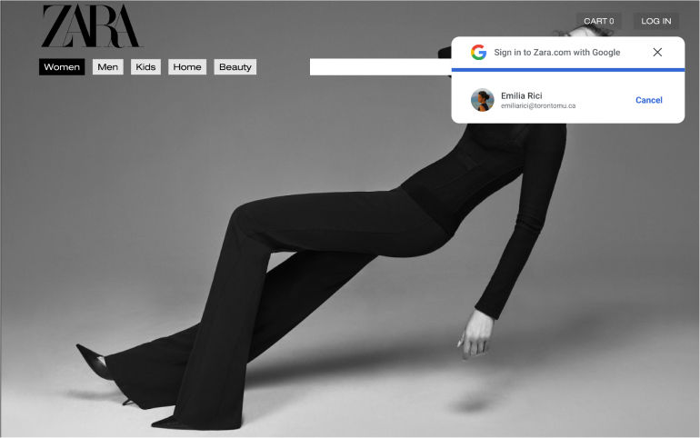
- Social media authentication integration
- Enhanced I.A. for Menu items
- Improved Page Navigation
- Quick Selection Button
Goals
In our creative journey to redesign the Zara website these were our goals:
- Enhance navigation systems and remove obvious roadblocks in the user experience
- Create a customized and delightful experience for users to address usability issues surrounding online shopping
- Clarify confusions and empower users by providing reliable and easily found information
Design Rationale
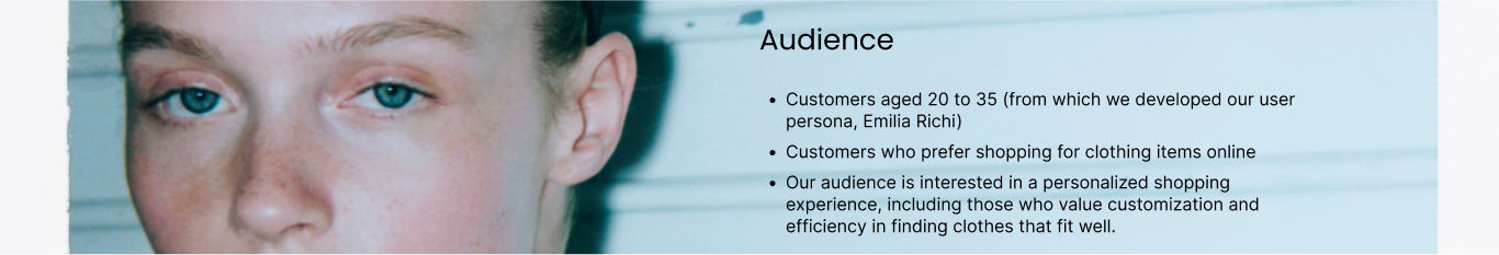
To best enhance the Zara website, our team relied heavily on user research and interviews to understand the needs and goals of our target audience.
- The largest issue that prevented users from shopping online was too much emphasis on minimalism, leading to unclear navigation and insufficient details for the users to make informed decisions.
- Moreover, there was no reliable way to tell if the clothing would fit and if other colours were available.
User Interview
- 20 users were interviewed in a semi-structured format as part of the initial user research.
- The open-ended questions helped gain an in-depth understanding of the respondent's feelings and beliefs on shopping apparel.
- While the questions were prepared ahead of time, the order was adjusted, redundant questions were skipped and new ones were improvised when necessary in order to extract deeper insights.
- The flexibility made the interview flow more authentic and offered the chance to discover gems of information that would have been missed in a dry and rigid interview format.
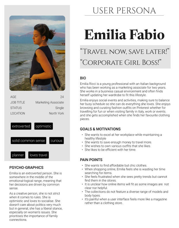
Persona
The persona was carefully crafted using insights gleaned from the 20 user interviews, empathy map and journey mapping.
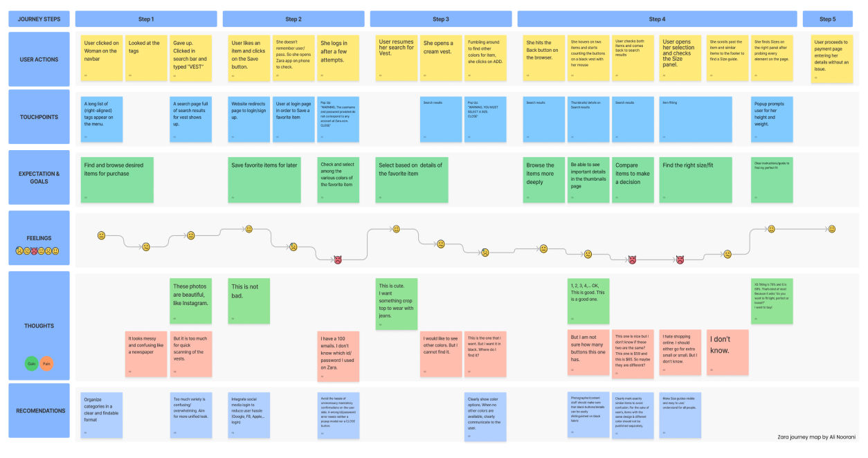
User Journey Map
The journey mapping was conducted with a User similar to our Persona who was tasked to complete a major flow i.e. finding a product, saving favourites and then buying an item on the website.
The user’s interactions were recorded using screen and voice recording and were complemented with observations and questions. Questions were asked only after a user completed the steps of a journey in order not to hinder or obstruct her natural flow.
Here is a visualisation of the journey that the User took to buy a vest on the zara.com website.
Solutions
Our solution, incorporating personalization throughout the user journey, ensures that information and options provided are well-organized and specific to the user.
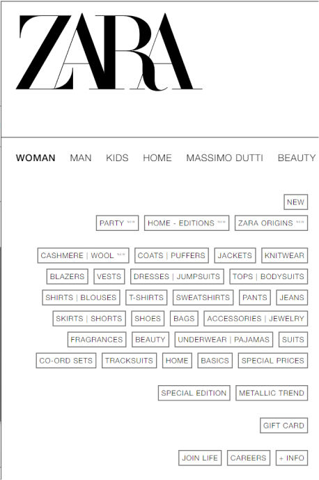
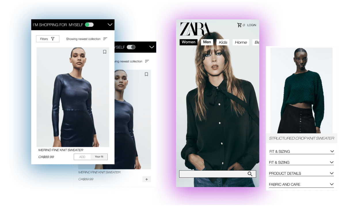
Under the Women menu, almost 40 tags are dropped in an illegible right-aligned pile, leaving users unable to scan the provided options and make decisions.
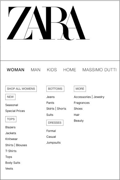
New menu based on user research, comparative analysis and user feedback.
Customization
- The second challenge was to create an easy-to-use customization tool for the customers to remove size concerns of Zara’s online shoppers.
- Through numerous iterations and testing, we introduced the “Fit for you” feature.
- To make it easy to understand, we refined the design and UX writing of current sizing quiz.
- This key feature creates a tailored experience for users to find appropriate apparel that aligns with their specific requirements of fit.
Fit for You
if a user selects the 'Fit for You' option and is looking to find a shirt, the sizes that fit them best would show up, ready to be bought with a single tap.
Customers would not have to go through items that do not have their size and would only see information relevant to them.
- A key design decision that I implemented was highlighting “Zara, Fit for You” on the home page and throughout the website.
- I aspired to make users have a personalised experience, ensuring that it was a central point displayed throughout our redesign.
I’m Shopping for myself
We also integrated Fit for You into the product cards with a prominent iconography (toggle switch at the top) plus a clear shopping button label “ADD Fit for you” signifying to the user why and how to use it.
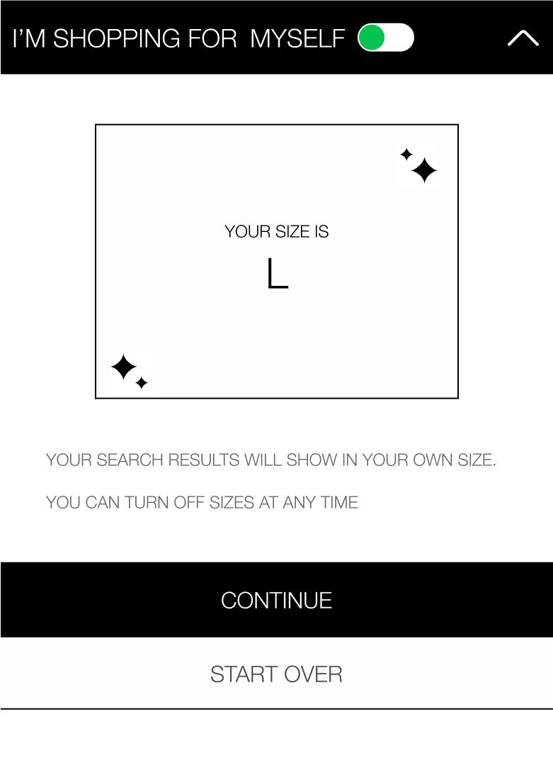
We unearthed the little-known size quiz and brought it front and center.

Reflection
- The Zara website would be vastly improved if the shopping experience was prioritized over brand style and aesthetic.
- The website should have a clear layout, highlighting individual clothing items, opting for clear and straightforward images, making each piece of clothing easy to view and its details more distinguishable.
Next
Through research we found that users did not see the kind of diversity and inclusivity that they wanted on Zara’s website. Thus, we suggest:
- Model sizes should range, with the ability to select one with a similar body type to the users. This should be accompanied by a clear size guide, explaining the item and model measurements so that a user is able to decide if a piece of clothing will fit them without having to try it on.